Sandstone
SC_015©25
Areas
- Branding
Overview
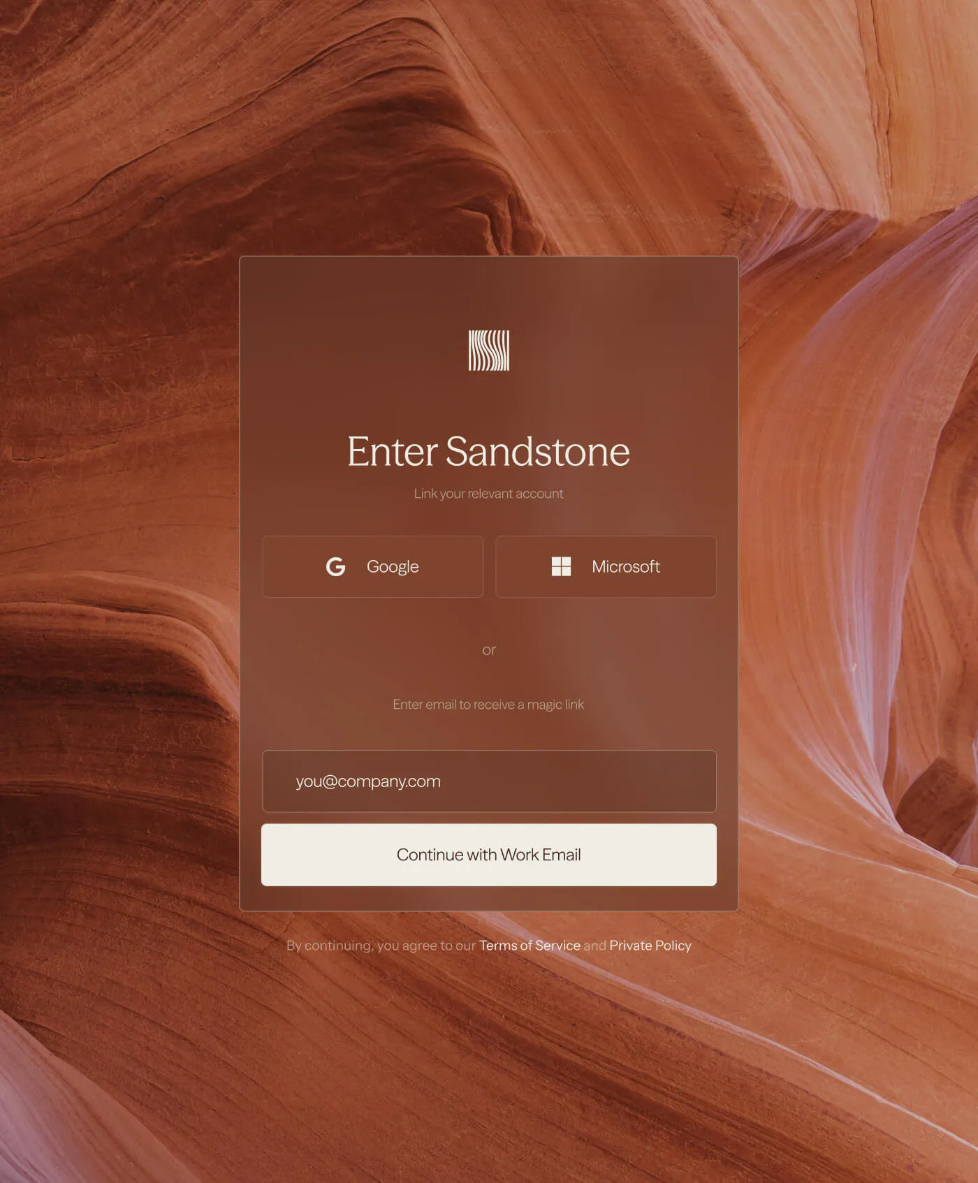
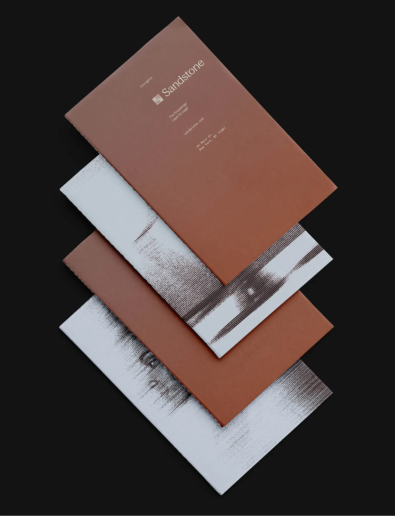
Built to transform legal complexity into clarity, Sandstone is the new home for AI-native legal departments. We partnered with their team to build a brand identity inspired by the organic layers, earthy tones, and enduring strength of sandstone itself. The result is a visual language that feels both professionally grounded and naturally sophisticated.
Credits
- Sunny Futures (Brand Strategy)
Links
Brandmark
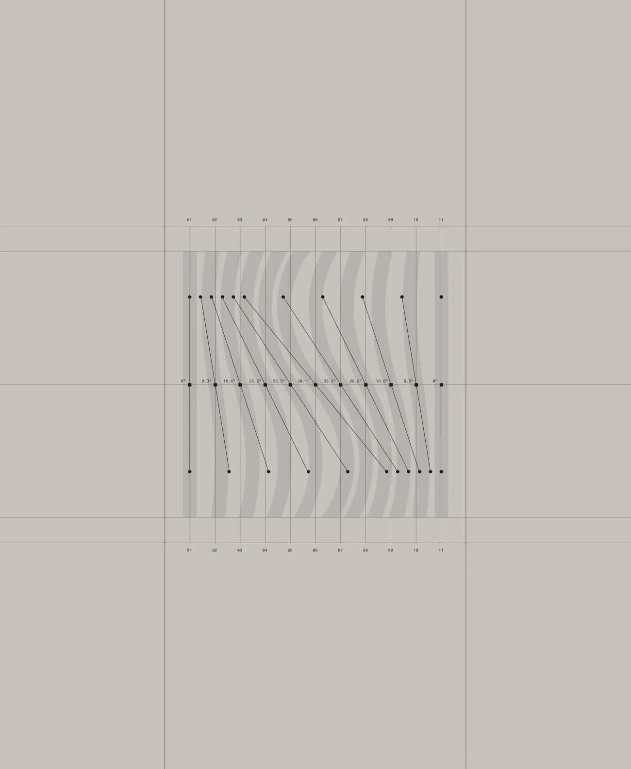
Inspired by the organic layers in sandstone, the logo transitions from curved to straight, both symbolising the shift
from complexity to clarity
in legal workflows, and building an abstracted ‘S’ letterform.
As a larger whole, these lines form a perfect square, communicating Sandstone's role as a strong, reliable foundation for legal teams.
Grid System
Our 10-column grid system is derived directly from the 11 lines in the Sandstone logo icon. These lines function as
the gutters between columns, ensuring balance and promoting a clean, uncluttered layout.
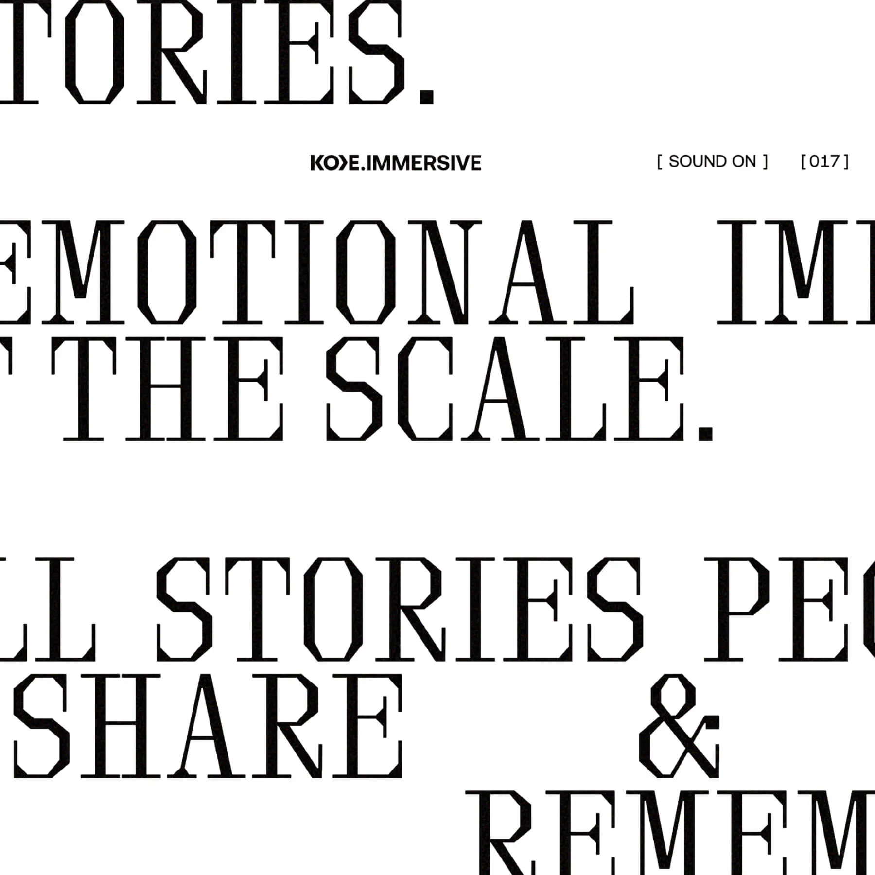
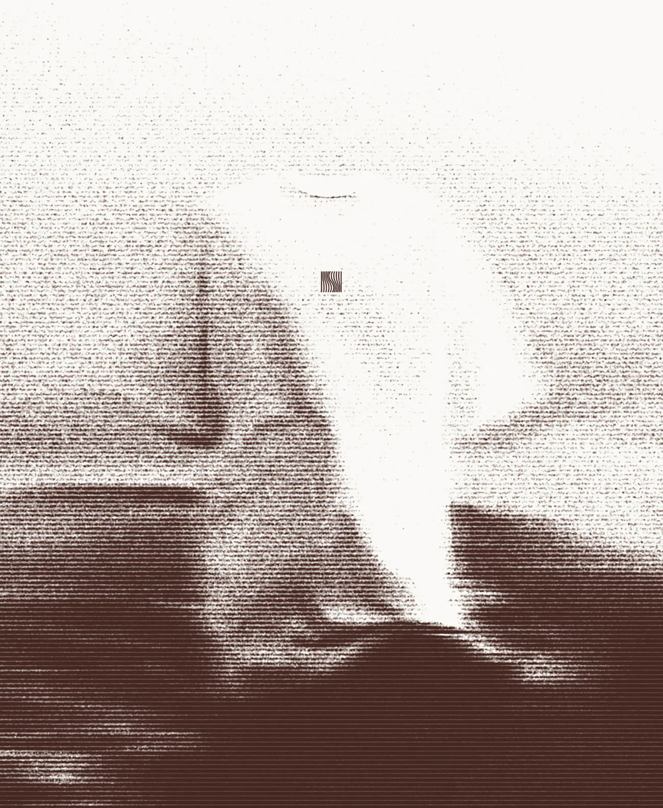
A key element of our design language is the deliberate placement of text images within this grid.
3D Assets
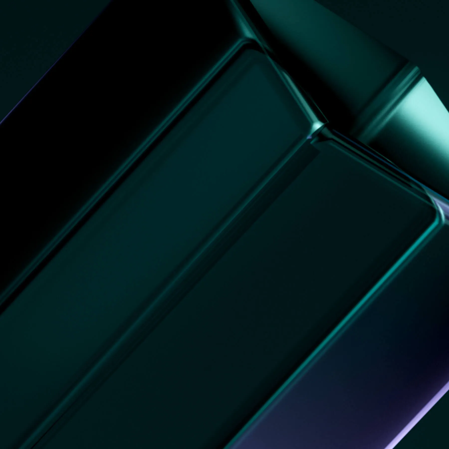
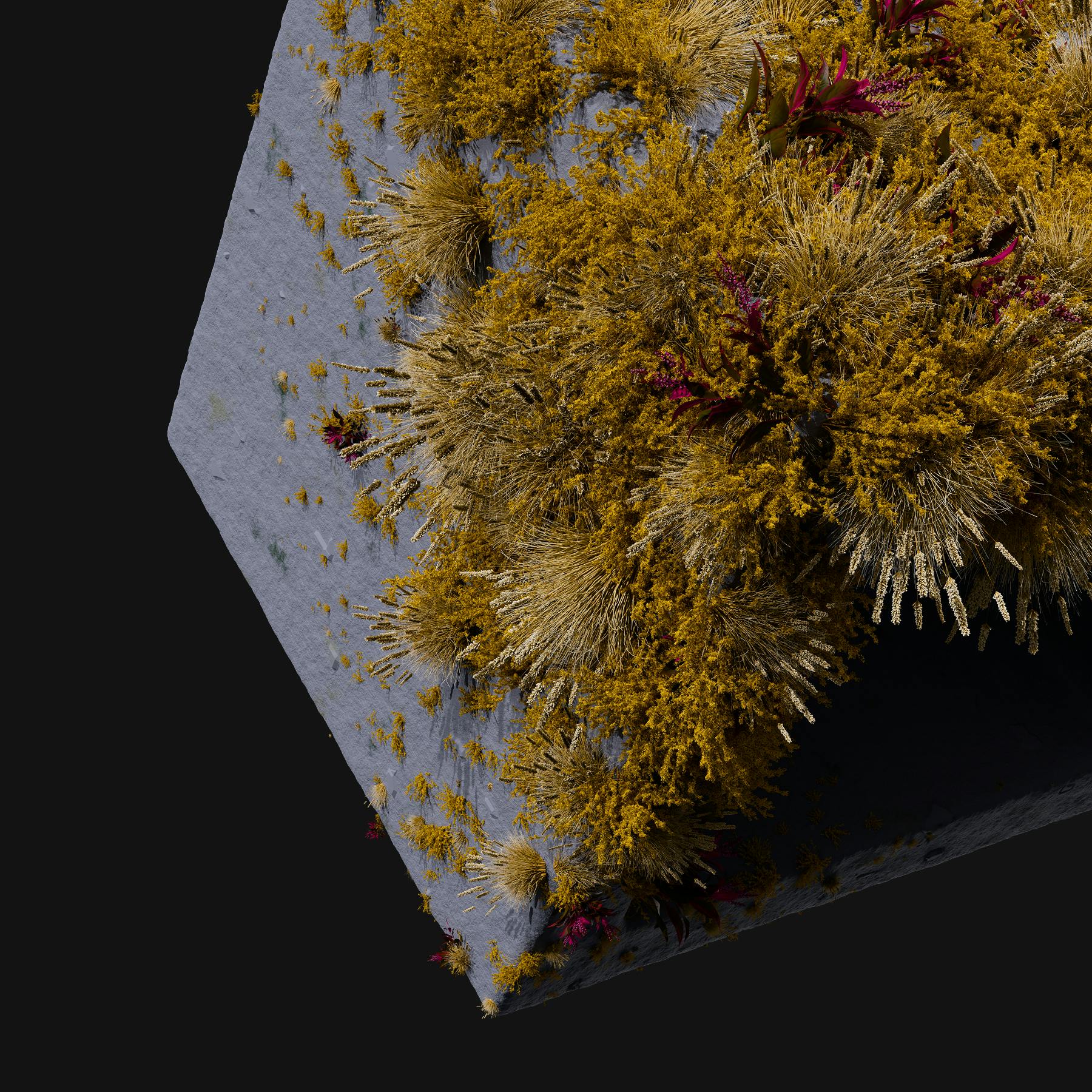
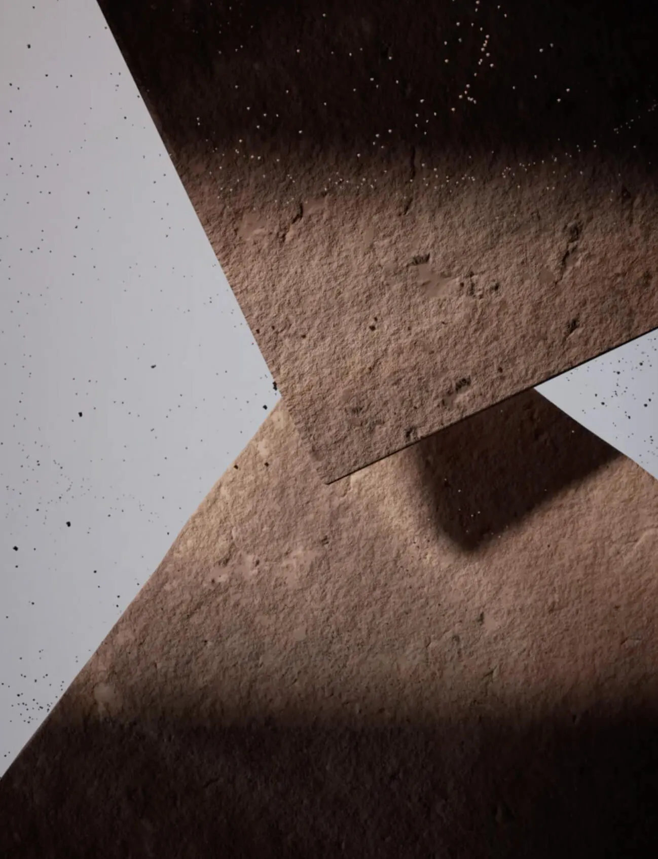
Using the Sandstone icon, we created a 3D version to elevate the brand experience and bring a new dimension to the brand.
The 3D icon is made up of the vertical lines of the brandmark extended into slabs to make up a cube.
Times Square Billboard
January 2026